When it comes to creating a printed marketing campaign often the type of font that will be used is one of the last things that you think.
Generally, the design and the content are the foundation of graphic design, then follow the colors and images and only at this point, as everything seems ready, finally you go to consider the type of font to use.
But because the font is so important?
If a consumer is not able to read your manifesto, your striscione, your poster or your flyer then your message is lost instantly.
The text must be clear and easy to read, but at the same time should reflect your brand identity.
we at Outside Print We see every day passing before our eyes and in our cars hundreds of fonts and we have an idea of what works and what is best avoided.
Choosing a font has never underestimated, especially when printing.
Choose such a ligh font can not be successful, especially for printing in large format, as it provides written “read” and hardly distinguishable. In questi casi meglio optare per un font bold o semibold o condensed che consentono una buona visibilità dalle lunghe distanze rendendo chiaro il messaggio.
Per le tre immagini del post abbiamo scelto 3 font a nostro giudizio vincenti nella realizzazione di comunicazioni pubblicitarie che si adattano alla digital print.
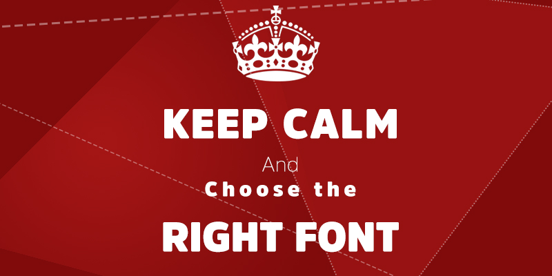
3 fonts that we recommend for your graphics projects
1.Amsi Pro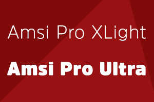
L’Amsi Pro è il font che abbiamo scelto per la prima immagine, si tratta di un font molto chiaro, disponibile in in versione light, bold e condensed. Creato dal designer Stawix Ruecha, si isira ad al font Block Berthold Condensed. Amsi Pro è perfetto per la creazione di headlines accattivanti e di sicuro impatto visivo.
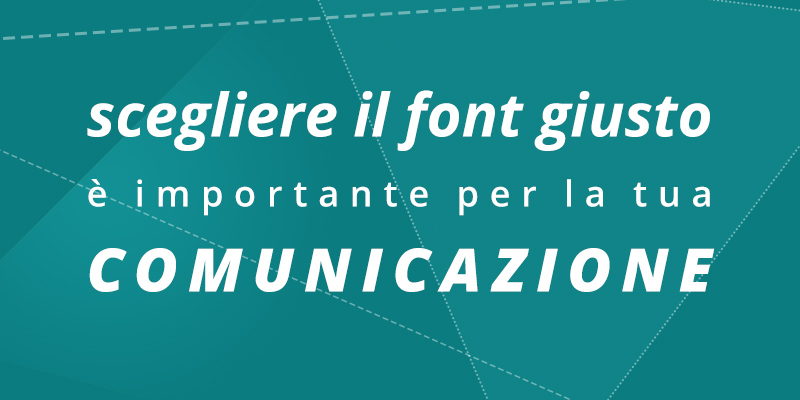
2. Open Sans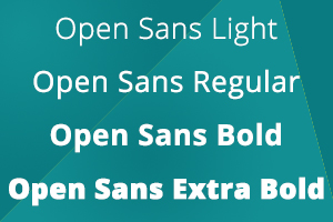
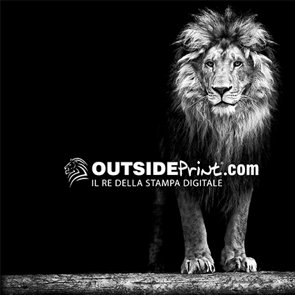
Per la seconda immagine abbiamo scelto l’Open Sans, un sans-serif disegnato da Steve Matteson e commissionato da Google. Le forme aperte e neutrelo rendono ideale e ottimizzato per la leggibilità attraverso stampa, web and mobile interfaces.
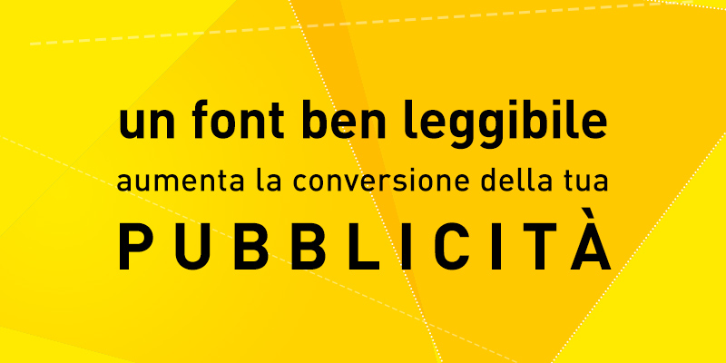
3. DIN
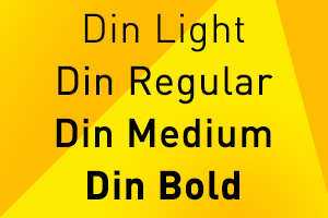
Infine vi proponiamo anche il font DIN. Si tratta di un carattere bastone che dagli anni ’30 fino al 2000 è stato utilizzato per le targhe automobilistiche tedesche. Grazie alla sua grande leggibilità viene utilizzato molto per la segnaletica stradale, si tratta di un font moderno che trasmette indubbiamente ordine.
E voi quali font utilizzate maggiormente per i vostri lavori? What are the fonts that you avoid for print projects?
OutsidePrint if offers, with experience, professionalism and passion, As partners in advertising and communication agencies, media centers, tipografie, architecture studies, interior designer, industrial businesses and industry professionals, providing its graphic and production department, which digital printing service.